
A below graph is shown throughput of Anti-DDoS application – Pravail from Arbor Networks. Can you interpret it? In my case, I can’t it but now I can do it 🙂
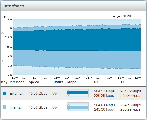
First of all, we need to know some terminology included the graph in order to interpretation.
- tx: Transmit

- rx: Receive
- External & Internal: Those are based on appliance. Once you see the left picture, you can easily understand these terminology.
Network traffic is flowing as follows.
(1) external rx –> (2) internal tx –> (3) internal rx –> (4) external tx
For example, if you under volumetric DDoS attack you will see a graph as below. A red arrow in the graph point to apply active mode on Anti-DDoS appliance.

The dropped point is shown that Anti-DDoS appliance was blocking malicious traffic inflow to internal area.


